BUFF MONSTER
MELT WITH ME
“ICE CREAM IS A METAPHOR FOR LIFE: FLEETING AND UNCERTAIN. YOU HAVE TO ENJOY IT WHILE IT LASTS”
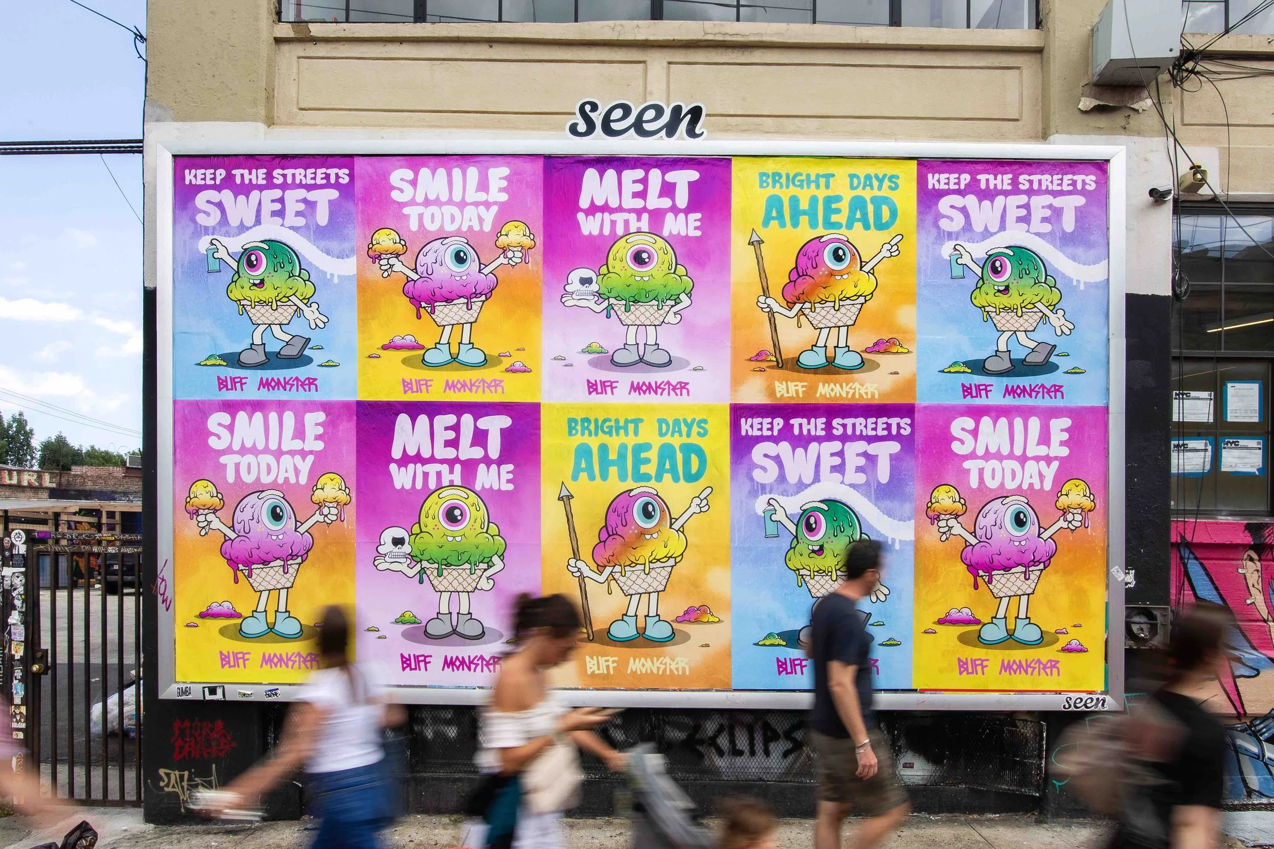
This summer, SEEN’s Summer Art Series has transformed New York City’s billboards and street posters into a citywide gallery, bringing art directly to the public. Among the featured artists is Buff Monster, whose universe is one of melting grins, bold colors, and a playful collision of pop, punk, and nostalgia. His characters, equal parts cartoon chaos and existential sweetness, have become fixtures in the global street art landscape since the early 2000s, bridging the worlds of graffiti, gallery, and collectible culture.
This summer, in collaboration with SEEN, Buff Monster returns to the medium where it all began: the streets. Displayed throughout Manhattan and Brooklyn, the series offers an ephemeral intervention in the city’s relentless pace. Like much of Buff Monster’s work, it quietly alters the rhythm, inviting passersby to pause, smile, and take in a moment of unexpected color, a fleeting reminder that joy can still sneak in between the cracks.
Through this collaboration, SEEN and Buff Monster demonstrate the power of public art to surprise, delight, and engage, proving that creativity doesn’t need a gallery—it just needs a city to call home.
The Melty Misfits.
Tell us a bit about yourself; your background, your journey, and how you found your way into making art.
As a kid growing up in Hawaii, I always drew. But when I got introduced to graffiti over thirty years ago, it opened up a new world. All of a sudden, making art could be an adventure and an activity to do with friends. My graffiti career was very short-lived, but I went on to wheatpasting hundreds (thousands?) of hand-silkscreened posters across LA (and beyond) over many many years. All along I made paintings and collectibles, and worked with some of the biggest brands on a variety of projects.


Your work is immediately recognizable. Who or what do you consider key influences; either in art or outside of it? Is there a visual lineage or cultural thread that you see yourself in?
Yes, for better or for worse! Ha! I’ve always been inspired by heavy metal music, Japanese culture, graffiti and the whole history of (Western) art. I guess I’m part of the street art movement, the low brow art movement, maybe the contemporary art movement if I’m feeling extra ambitious, but ultimately, I’m simply an artist (who’s done a lot of different things over many years).
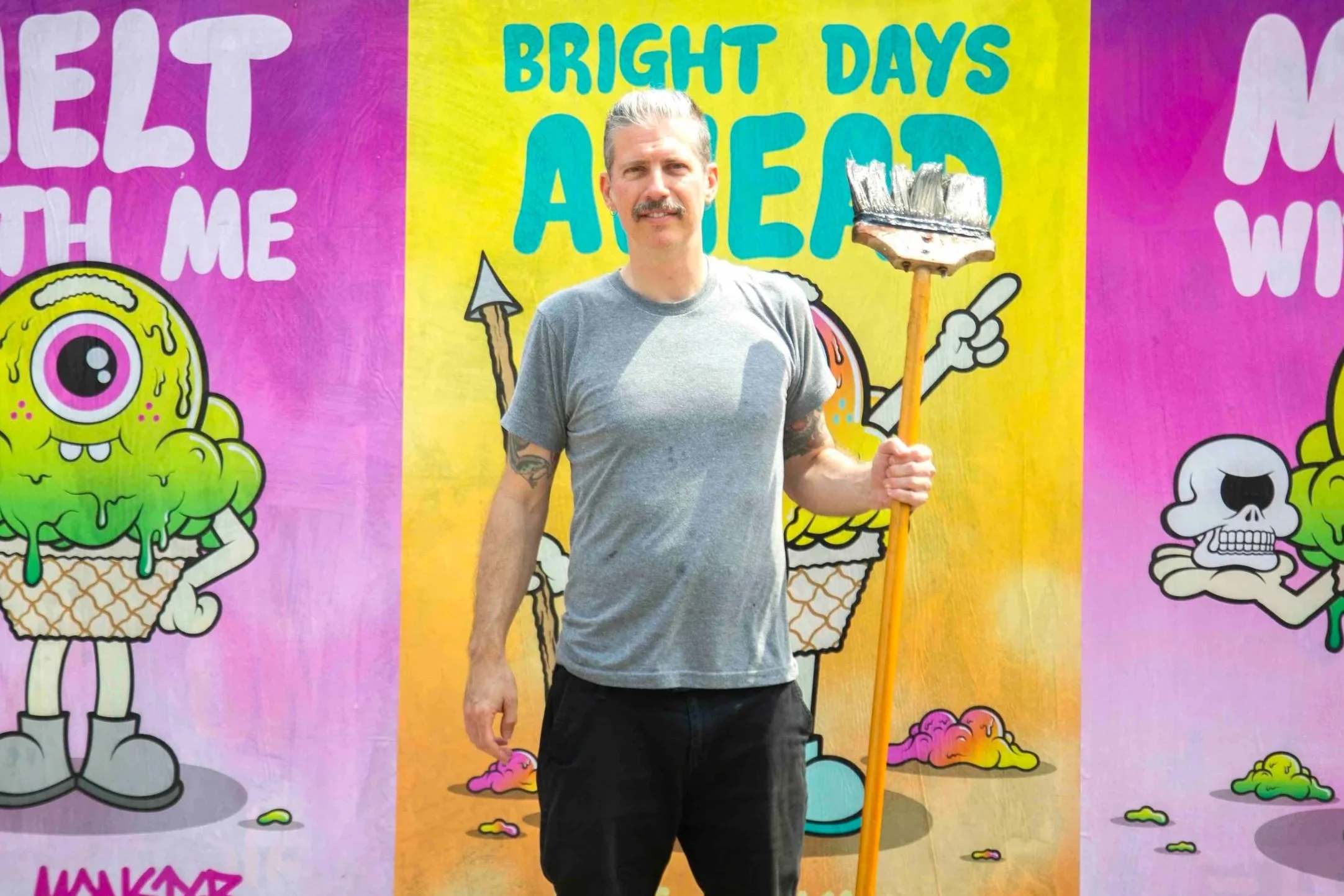
How did the collaboration with Seen Media come to life? What excited you about the idea of sharing your work through the Summer Art Series on the streets of NYC?
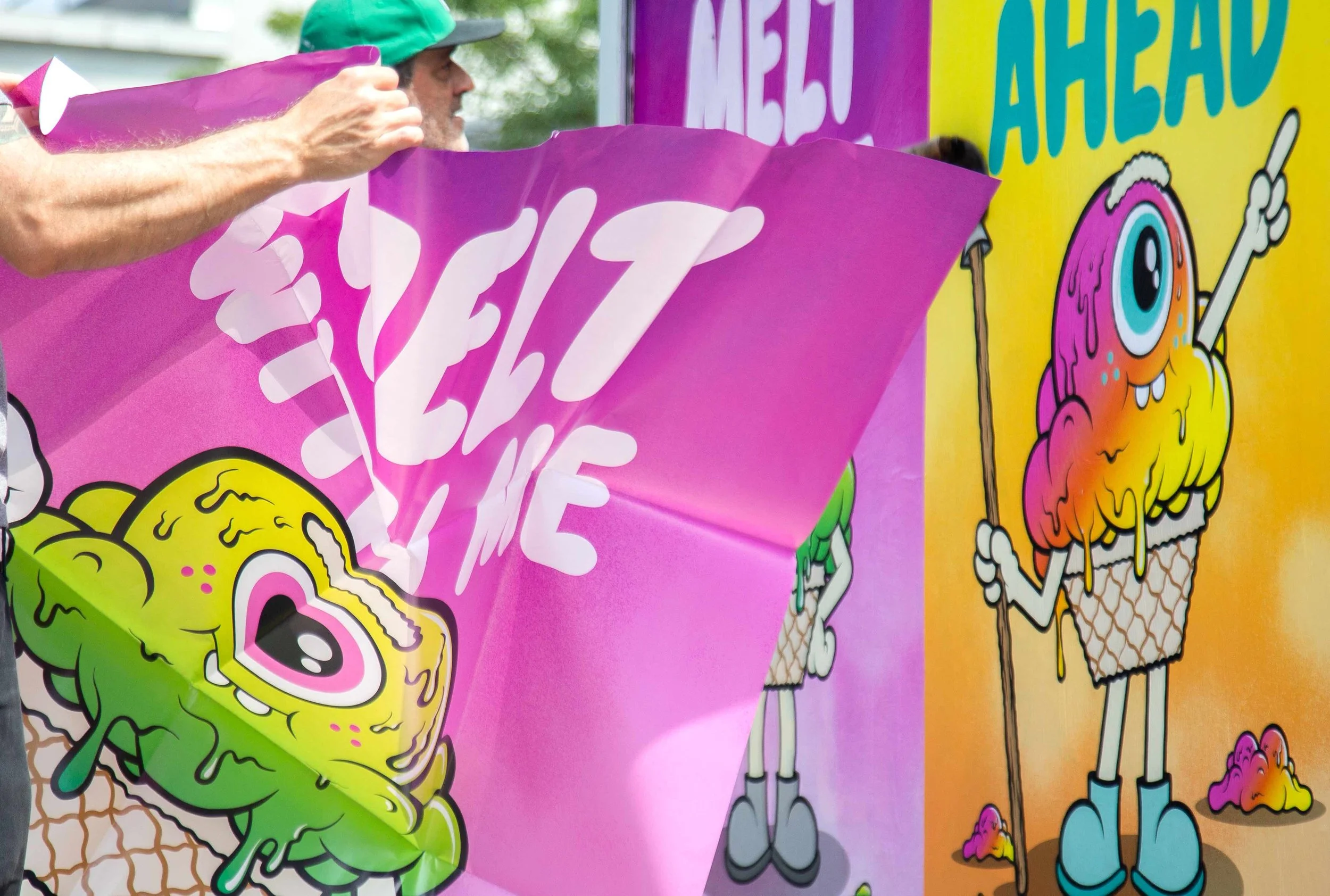
In the thirteen years that I’ve lived in NYC, I’ve always enjoyed painting murals, big and small, as my contribution to the ever-changing landscape of NYC. But wheatpaste posters are my roots; it’s how I made a name for myself over 20 years ago in LA. But when I moved to NYC, I stopped wheatpasting and started painting murals. So when Seen reached out about the opportunity to put up some posters around NYC, I was super excited! I wanted to approach them differently than I would have done in the old days. I spent a lot of time conceptualizing what this campaign could be and in the end, the 4 posters serve as a cohesive campaign (and leaves room for more in the future).

The “Melty Misfit” character feels like a central figure in your visual universe. Can you introduce us to them? What’s their story, and what do they represent to you?
As a stand-alone character, I’d call him Mister Melty; as a loose group of related characters, I’d call them The Melty Misfits. Either way, they’re embodiments of good vibes, and hopefully they communicate a range of emotions and complex siutations in a very relatable way, like any good cartoon character can. Ice cream is a metaphor for life, fleeting and uncertain, you have to enjoy it while it lasts.


Your palette is bold, loud, joyful. What draws you to these colors; and how do you use them to communicate?
I think my bright color palette comes from growing up in Hawaii; I don’t really know what else to attribute it to. But also, the work, and especially these posters, is about being optimistic and uplifting, so anything besides bright colors would be weird and incongruous.
Is there a message behind the work; or a feeling you hope to spark in people when they encounter it on the street?
Well, a very small minority of people who see the work will recognize it as mine, and in that case it should be consistent with my previous work. But the vast majority of people who pass by them, won’t have a background in art and certainly won’t be knowledgeable about the street art movement, so for them, the posters have to function in a very simple and direct way. And so without any context or background, I hope they read as nice uplifting messages of unknown origin.

Art on the streets is often fleeting, but also incredibly impactful. What kind of reaction are you hoping for with this series?
Serendipity is often a prerequisite for an impactful street art encounter; you should stumble upon it as you’re rushing to work or to meet a friend and cause you to stop for a few seconds as it unexpectedly captures your attention. So the goal is just for people to happen upon them and enjoy them for a fleeting moment.
Looking ahead, what’s next?
Just finished a cool little mural in Little Italy and I’m always crankin’ on new things in the studio. Later in the year, I have a month-long artist residency, so that’ll be a new experience. But, of course, thanks again to Seen Media for the opportunity to get more art out on the streets of NYC!!